Affiliate disclosure: This article contains affiliate links. We may earn a small commission if you purchase through these links, at no extra cost to you. We only recommend products we trust.
What Is Driving Paint Color Trends This Spring
Every spring, paint manufacturers release their trend forecasts, and designers rush to declare the “new neutral.” But as someone who has spent years rolling paint onto real walls in real homes, I can tell you that most of those forecasts miss what actually matters: how a color looks in your specific room, under your specific light, next to your specific flooring.
That said, the 2026 color palettes from Benjamin Moore, Sherwin-Williams, Behr, and PPG are genuinely worth paying attention to this year. The shift toward warm earthy tones and nature-inspired palettes is not just marketing — it reflects a broader move toward homes that feel grounded, calm, and connected to the outdoors.
I have been testing several of these trending colors on client projects over the past few months. Here is what actually works, what is overhyped, and how to choose the right spring colors for your space.
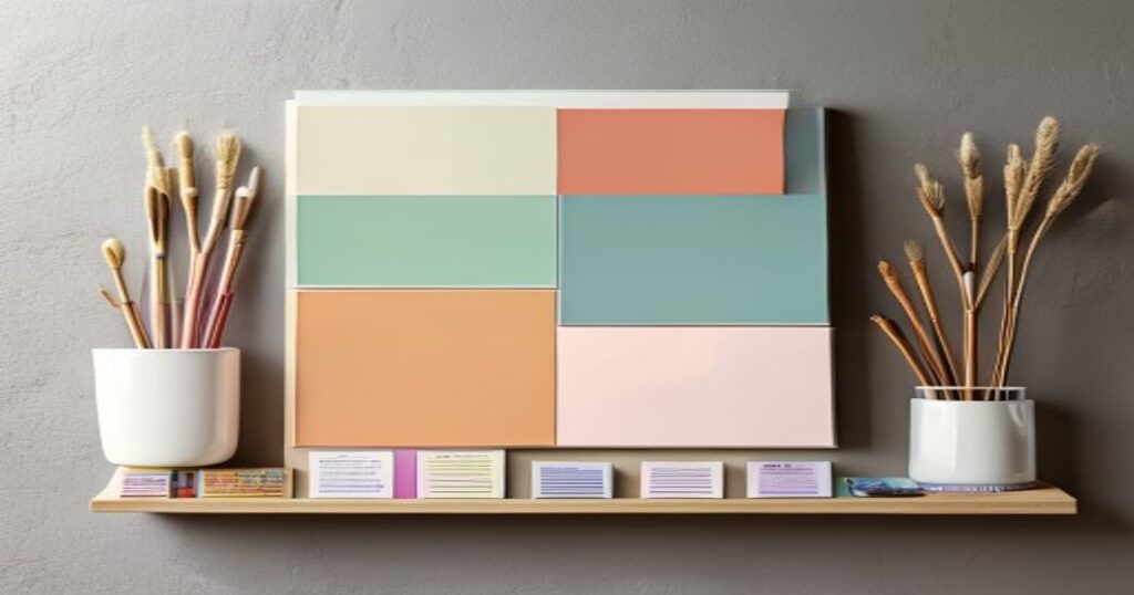
The Big Color Stories for Spring 2026
Three themes dominate the spring 2026 palette across all major paint brands. Understanding these themes helps you pick colors that will still look current in five years, not just five months.
Warm Earthy Neutrals
The biggest shift this year is away from cool grays and toward warm, sandy neutrals. Think khaki, warm taupe, clay, and soft terracotta. According to Brick and Batten’s exterior color analysis, these warm tones pair naturally with wood, stone, and other organic materials that dominate current home design.
In my experience as a plasterer-painter, warm neutrals are far more forgiving than cool grays on imperfect walls. They absorb light softly rather than highlighting every bump and seam. If your walls have any texture issues, warm tones are your friend.
Best for: living rooms, hallways, exteriors, open-concept spaces where you need a unifying backdrop.
Nature-Inspired Greens
Muted olive, sage, and forest greens continue their dominance from 2025 into spring 2026. Dunn-Edwards calls their 2026 palette “A Quiet Joy,” and green is central to that story. These are not bright Kelly greens — they are subdued, almost dusty shades that feel serene rather than bold.
I have painted three kitchens in sage green tones this spring, and every client has been thrilled. The trick is choosing a green with enough gray or brown in it to prevent the room from feeling like a nursery. Benjamin Moore’s Cushing Green and Sherwin-Williams’ Evergreen Fog are safe bets.
Best for: kitchens, bathrooms, home offices, bedrooms.
Rich, Moody Darks
Benjamin Moore’s 2026 Color of the Year is a commanding charcoal-espresso shade that blurs the line between brown and black. This signals a growing appetite for dramatic, cocooning spaces — especially in dining rooms, accent walls, and powder rooms.
A word of caution from years of applying dark paints: coverage matters enormously. You will almost certainly need three coats with darker colors, and the sheen finish makes a huge difference. I always recommend understanding your finish options before committing to a dark color. A matte finish hides imperfections but shows scuffs; a satin finish is easier to clean but reveals wall texture.
Best for: accent walls, dining rooms, powder rooms, feature walls.
2026 Colors of the Year: Brand by Brand Comparison
Every major paint brand selects a Color of the Year, and these picks influence what you will see on store shelves and in design magazines. Here is how they compare:
| Brand | Color of the Year | Color Family | Best Room | Pro Tip |
|---|---|---|---|---|
| Benjamin Moore | Charcoal-Espresso | Deep warm neutral | Dining room, accent wall | Use Regal Select for best coverage on dark shades |
| Behr | Hidden Gem | Muted teal-green | Bathroom, bedroom | Pairs beautifully with brass fixtures |
| Sherwin-Williams (HGTV Home) | Nature-inspired collection | Earthy greens and clays | Living room, kitchen | Test in north-facing light before committing |
| PPG | Trending warm tones | Clay, terracotta | Exterior, entryway | Apply primer first on porous surfaces |
| Dunn-Edwards | A Quiet Joy palette | Soft pastels, warm neutrals | Bedroom, nursery | Low-VOC formula ideal for occupied rooms |
Room-by-Room Color Recommendations
Trend palettes are helpful, but they mean nothing if you pick the wrong color for the wrong room. Here is my room-by-room guide based on the 2026 trends and my hands-on experience painting hundreds of rooms.
Living Room
Warm neutrals dominate here. A sandy taupe or warm greige (gray-beige) works in almost every living room because it adapts to both natural and artificial light. Avoid pure white — it looks clinical in large spaces and shows every mark.
If you want to incorporate the green trend, paint one accent wall in sage and keep the remaining walls in warm white. This gives you the trendy look without overwhelming the space. Before painting, make sure your walls are properly prepped — our guide on how to prep walls for painting covers the steps most DIYers skip.
Kitchen
Sage green and soft olive are the top choices for kitchens in 2026. They create a fresh, organic feel that complements both white and wood-toned cabinets. If you are considering painting your kitchen cabinets, a white or cream cabinet with sage walls is one of the most requested combinations I have seen this year.
For kitchen walls, always use satin or semi-gloss finish. Kitchens generate grease and moisture that flat paint cannot handle. Check our complete guide to paint finishes for the science behind this recommendation.
Bedroom
The 2026 trend toward “quiet joy” palettes is perfect for bedrooms. Soft, muted tones — dusty blue, pale sage, warm blush, or light clay — create the calm atmosphere that promotes better sleep. Avoid high-contrast or saturated colors in a room designed for rest.
I always recommend low-VOC paints for bedrooms since you spend 8 hours breathing in that air. Our roundup of the best low-VOC and eco-friendly paints lists options that perform as well as conventional paints without the off-gassing.
Bathroom
Behr’s Hidden Gem — a muted teal-green — is outstanding for bathrooms. It reads as both calming and sophisticated, especially when paired with white tile and brass or gold fixtures. Bathrooms are the perfect place to experiment with bolder colors because the small size limits the commitment.
Use semi-gloss or high-gloss paint in bathrooms to resist moisture and mildew. And make sure your caulking is solid before you paint — nothing ruins a fresh paint job like peeling caulk. Here is our step-by-step on how to caulk a bathtub properly.
Exterior
Warm whites, sage greens, and deep charcoals are the exterior trendsetters for 2026. The move away from stark white and gray exteriors toward warmer, earthier tones is one of the strongest shifts I have seen in years.
If you are planning an exterior repaint, spring is the ideal time — temperatures between 50-85F give paint the best curing conditions. Our comprehensive guide on how to paint the exterior of your house walks you through every step from pressure washing to final coat.
How to Choose the Right Color for Your Light
This is the single most important piece of advice I give to every client, and no trend article ever covers it properly: the same color looks completely different depending on your room’s light.
North-facing rooms get cool, blue-toned light. Warm colors (clays, warm taupes, soft yellows) work best here because they counterbalance the cool light. Avoid cool grays or blues — they will look frigid.
South-facing rooms get warm, golden light. You have more flexibility here. Both warm and cool tones work, but colors will appear more saturated than they look on the swatch.
East-facing rooms get warm morning light and cool afternoon light. Choose a color that you like in both conditions. Test your samples at 10 AM and 4 PM before committing.
West-facing rooms get intense, warm afternoon light. Colors can look washed out in the morning and overly warm in the evening. Muted, mid-tone colors handle this range best.
My non-negotiable rule: always buy a sample pot and paint a 2×2 foot patch on the actual wall. Live with it for 48 hours. Look at it at different times of day. This $8 investment prevents a $200 mistake. Use our paint calculator to figure out exactly how much paint you will need once you have chosen your color.
Eco-Friendly Paint Options for 2026 Trends
Many of the trending 2026 colors are available in low-VOC and zero-VOC formulations. This matters for both indoor air quality and environmental impact.
Top eco-friendly paint lines that carry the trending colors:
- Benjamin Moore Natura: Zero-VOC, excellent coverage, available in all 2026 trending shades. This is my go-to recommendation for bedrooms and nurseries.
- Sherwin-Williams Harmony: Zero-VOC with antimicrobial properties. Good coverage, slightly thinner than Natura so may need an extra coat.
- Behr Premium Plus: Low-VOC, widely available at Home Depot. Their Hidden Gem Color of the Year is available in this line. Solid performance for the price point.
- ECOS Paints: Zero-VOC, zero-toxin. The most environmentally friendly option, though limited color selection in trend shades.
For a deep dive into eco-friendly paint performance and pricing, check our full eco-friendly paint guide.
If you are planning a full room makeover this spring, the Renovation Planner helps you budget paint, supplies, and labor costs before you start — so you do not run out of funds halfway through the project.
Essential Supplies for a Spring Paint Project
Having the right tools matters as much as choosing the right color. Here is what I recommend for any spring painting project:
- Quality roller covers: Use 3/8″ nap for smooth walls, 1/2″ for lightly textured walls. Cheap rollers shed fibers into your paint. Wooster Pro roller covers are what I use on every job.
- Angled brush: A 2.5″ angled sash brush handles cutting in around trim, ceilings, and corners. Purdy brushes hold their edge for thousands of linear feet.
- Painter’s tape: FrogTape or ScotchBlue for clean lines. Remove it while the paint is still tacky for the crispest edges.
- Drop cloths: Canvas, not plastic. Plastic gets slippery and moves around. A 9×12 canvas drop cloth covers most rooms adequately.
For a complete equipment guide, see our paint sprayer roundup if you want faster coverage on large projects, or our best interior paints guide for detailed product reviews and price comparisons.
Frequently Asked Questions
What is the most popular paint color for 2026?
Warm earthy neutrals lead the 2026 trends, with sandy taupes, warm greige, and clay tones topping the popularity charts. Benjamin Moore’s charcoal-espresso Color of the Year and Behr’s Hidden Gem (muted teal-green) are the two most talked-about specific shades. For a safe, versatile choice, a warm neutral in the taupe-to-clay range works in almost any room.
Are gray walls still in style in 2026?
Cool grays are declining in popularity, but warm grays (greige tones with brown or taupe undertones) remain relevant. The shift is from cool and clinical to warm and inviting. If you currently have gray walls and want an update without a full repaint, swapping cool gray accessories for warm-toned textiles can modernize the look.
What paint colors make a small room look bigger?
Light, warm neutrals reflect the most light and make walls appear to recede. Soft warm whites, pale clays, and light sage greens all work well in small spaces. The 2026 trend toward muted, nature-inspired tones is actually great for small rooms because these colors feel expansive without being sterile. Avoid dark accent walls in rooms under 100 square feet — they close the space in.
How many coats of paint do I need for 2026 trending colors?
Most trending warm neutrals cover well in two coats over properly primed walls. Dark colors like Benjamin Moore’s charcoal-espresso shade typically require three coats. Deep greens usually need two to three coats depending on the base color underneath. Always use a tinted primer that matches your paint color family to reduce the total number of coats needed.
Is it worth painting my house to sell in 2026?
Fresh interior paint consistently delivers one of the highest ROIs of any home improvement project — typically 100-200% return. Stick with warm neutrals (greige, warm white, soft taupe) for resale appeal. Avoid trendy bold colors that might not match a buyer’s taste. A full interior repaint typically costs $2,000-$5,000 for a professional job, or $300-$800 DIY for an average-sized home.
Get Our Free Painting Tips Newsletter
Pro techniques, product reviews, and DIY guides delivered weekly. No spam — just useful stuff from a real painter.
About the Author: As a professional plasterer-painter with years of hands-on experience in home renovation, I write about painting techniques, materials, and design from the perspective of someone who does this work every day. Every recommendation in this article comes from real-world testing on actual job sites — not just trend reports.
Get Your Free Home Renovation Checklist
Join 500+ homeowners saving money on their renovations. Free checklist + weekly tips.